
tutorials:r_plots
Table of Contents
R plots
Box plots
An user guide to walk through data visualization by box plot in R.
Please download the tutorial and open with browser (like Chrome) for more detail.
One batch with replicates
Sample input
R script
- single-batch_boxplot.R
rm(list=ls())

# working directory
setwd("/home/hychang/R_pwd/2026-09-14_R-plots/Box_plots/")

# load packages
library(readxl)
library(ggplot2)

### Step 1. import data, choose one of them to import file
# (1) fill in full path of your file and the sheet name
df1= read_xlsx("/home/hychang/R_pwd/2026-09-14_R-plots/Box_plots/sample1.xlsx", sheet = "Sheet1")

# (2) If you don't know the full path, use file.choose to select your file,
#     remember fill in the sheet name
df1= read_xlsx(file.choose(), sheet = "Sheet1")


### Step 2. import the multiple comparison result (optional)

df2= read_xlsx("/home/hychang/R_pwd/2026-09-14_R-plots/Box_plots/sample1.xlsx", sheet = "Sheet2")


### Step 3. Inspect data

# dimension
df1; dim(df1)
df2; dim(df2)

# counts of strain
table(df1$"Strain")
table(df1$"Strain", useNA = "always")

# range of value
range(df1$"Value")


### Step 4. setting sample order

# set your ordering in levels
df1$"Strain" = factor(df1$"Strain",
                      levels = c("A", "B", "C"))


### Step 5. plot

# version 1
# all data points using a single, uniform color.
p1= ggplot(data = df1, aes(x= Strain, y= Value))+
  geom_boxplot(width = 0.4, outlier.shape = NA)+
  geom_point(color= "#003175", size= 2,
             position = position_jitter(width = 0.2,height = 0))+
  scale_y_continuous(limits = c(0, NA))+
  labs(x= "Strain", y= "Value")+
  theme_classic()+
  theme(axis.title = element_text(size = 16),
        axis.text = element_text(size = 14))

# show plot
p1


# version 2
# Colors data points by Strain and adds statistical significance group labels at the top.
p2= ggplot(data = df1, aes(x= Strain, y= Value))+
  geom_boxplot(width = 0.4, outlier.shape = NA)+
  geom_point(aes(color= Strain), size = 2,
             position = position_jitter(width = 0.2,height = 0))+
  geom_text(data = df2, aes(x= Strain, y= Inf, label = groups), vjust= "inward")+
  scale_color_manual(values = c("#1B9E77", "#D95F02", "#7570B3"))+
  scale_y_continuous(limits = c(0, NA))+
  labs(x= "Strain", y= "Value")+
  theme_classic()+
  theme(axis.title = element_text(size = 16),
        axis.text = element_text(size = 14))

# show plot
p2


### Step 6. Export

# version 1 PDF export
pdf("simple_boxplot1.pdf")
p1
dev.off()

# version 2 PDF export
pdf("/home/hychang/R_pwd/2026-09-14_R-plots/Box_plots/simple_boxplot2.pdf")
p2
dev.off()

# change the width and height to 6 and 4 in inch
pdf("simple_boxplot1_w6h4.pdf", width = 6, height = 4)
p1
dev.off()

pdf("simple_boxplot2_w6h4.pdf", width = 6, height = 4)
p2
dev.off()


# version 1 PNG export
png("simple_boxplot1.png")
p1
dev.off()

# version 2 PNG export
png("simple_boxplot2.png")
p2
dev.off()

# change width and height to 600 and 400 in pixels
png("simple_boxplot1_w600h400.png", width = 600, height = 400)
p1
dev.off()

png("simple_boxplot2_w600h400.png", width = 600, height = 400)
p2
dev.off()
Sample output
Plots can be exported as PDF or PNG files. Here shows the PNG files.
- Version 1: Displays all data points using a single, uniform color.
- PNG: setting width 600 and height 400.
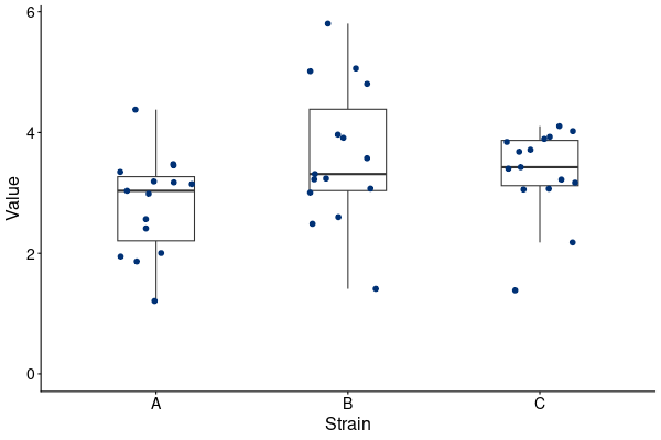
- PDF: width 6 inch and height 4 inch. simple_boxplot1_w6h4.pdf
- Version 2: Colors data points by Strain and adds statistical significance group labels at the top.
- PNG: setting width 600 and height 400.
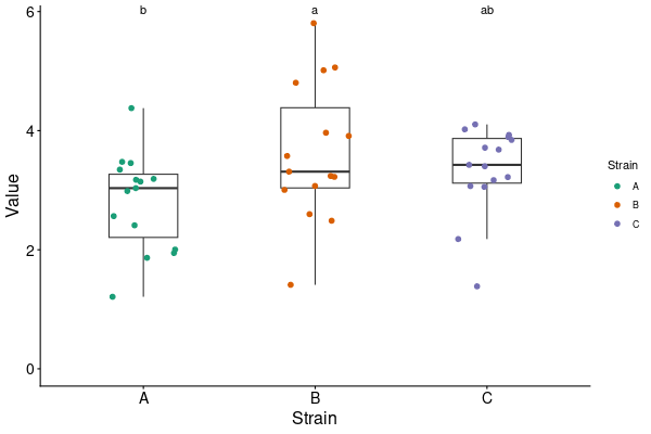
- PDF: width 6 inch and height 4 inch. simple_boxplot2_w6h4.pdf


Multiple batches with replicates
Sample input
R script
- Please download the R script using the link below.
Sample output
Plots can be exported as PDF or PNG files. Here shows the PNG files.
- Version 1: Displays data with batches shown in distinct colors.
- PNG: setting width 600 and height 400.
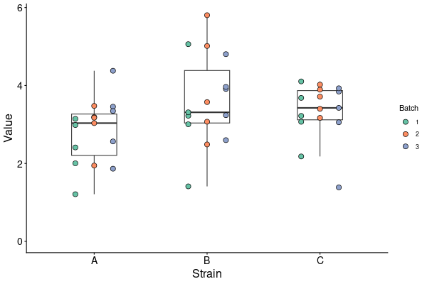
- PDF: width 6 inch and height 4 inch. mult_boxplot1_w6h4.pdf
- Version 2: Displays batches in distinct colors and adds statistical significance group labels at the top.
- PNG: setting width 600 and height 400.
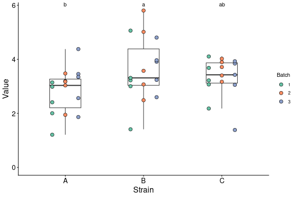
- PDF: width 6 inch and height 4 inch. mult_boxplot2_w6h4.pdf


tutorials/r_plots.txt · Last modified: by chkuo